This first map is a map of the entire universe. Realistically, this is probably a humble attempt at mapping something far greater than the scope of modern human knowledge. This map happens to be from a magazine spread in National Geographic. I chose this map because it encompasses all other maps, so to speak. This is a map of literally everything in the known universe, and it shows how insiginificant we are. We mean nothing to this map. We are but a single nut in the turd of squirrel (assuming squirrel turds are extremely nutty). In contrast, map making becomes very significant through this map, to illustrate that we are tiny and meaningless and to understand where the hell we are in the universe. And as the map shows, we're just a planet in a galaxy of a billion stars, in a universe with hundreds of billions of galaxies. The map conveniently says that just to find the Milky Way galaxy, the maker of this map had to magnify the scale 5 times "just to find our solar system."

My second map is from the google machine and is a lesson in spatial mapping and personal sense of direction. By utilizing landmarks such as "Shipwreck Island" and geographical features like "Dead Man Creek" one can navigate a pirate infested and booby trap laden tropical island with relative ease. Simply follow the dotted line and when you reach the gian "X" start digging...unless you get scurvy and die along the way. I chose this map mainly because of its ornate and gaudy compass. A map is nothing without a good compass that illustrates the cardinal directions. I particularly like this map in contrast with the one above because it depicts the advances in map making technology. This map was made on a scroll of parchment and what appears to be crayons, whereas the map of the universe was made with advanced telescopes, computers and 3-D imaging software (an instant geologist turn on). But honestly, down to brass tacks...why is that boy so big? Was there a toxic spill on the island? Is there some strange evolutionary trend of gigantism? Or maybe that's just a cute baby whale. Doesn't matter. Ths whole debacle would've been avoided had the map maker been so prudent as to include a scale. To next time, include a scale...or be prepared to fail. (RHYMES!!!!)
That boy is as big as a whale! A lesson in scale (and rhyming)

My second map is from the google machine and is a lesson in spatial mapping and personal sense of direction. By utilizing landmarks such as "Shipwreck Island" and geographical features like "Dead Man Creek" one can navigate a pirate infested and booby trap laden tropical island with relative ease. Simply follow the dotted line and when you reach the gian "X" start digging...unless you get scurvy and die along the way. I chose this map mainly because of its ornate and gaudy compass. A map is nothing without a good compass that illustrates the cardinal directions. I particularly like this map in contrast with the one above because it depicts the advances in map making technology. This map was made on a scroll of parchment and what appears to be crayons, whereas the map of the universe was made with advanced telescopes, computers and 3-D imaging software (an instant geologist turn on). But honestly, down to brass tacks...why is that boy so big? Was there a toxic spill on the island? Is there some strange evolutionary trend of gigantism? Or maybe that's just a cute baby whale. Doesn't matter. Ths whole debacle would've been avoided had the map maker been so prudent as to include a scale. To next time, include a scale...or be prepared to fail. (RHYMES!!!!)
He sees you when you're sleeping...he knows when you're a-mapping.

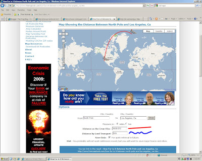
The final map in this amazing blog is a map of the route Santa takes each year to my apartment. (The map is from the website freemaptools.com.) This map not only shows the distance it takes for Rudolph to guide Santa's sleigh to deliver my Zach Effron action figure with karate-chop action, it shows the expanse of the whole world. This really demonstrates what an amazing feat it is for Santa to deliver toys to all the nice boys and girls all over the world. Although let's be real, Santa doesn't exist. Most likely he died a long time ago, but was smart enough to create an army of Santa look-alike robots capable of working twice as hard as the real Santa (for much cheaper, kind of like Asian children). These robot Santa's are able to utilize the highly combustible combination of milk and cookies to travels at super-human speeds. But I digress. The truth is, this map is intersting because of the flight path Santa takes. I wanted to show that you cannot take all maps at face value. Although it looks like Santa is traveling a much longer distance than necessary, that is in fact the shortest route to deliver my toys. That is because of the way maps are usually flat and 2-D while the Earth is usually spherical and 3-D. The curve in the route follows the curvature of the Earth. Which I think is pretty cool.