Tuesday, December 8, 2009

GIS + Census Data = awesomeness.

Tutorial maps (Left to Right: Difference in Population 1990-2000, Population Density 2000, Percent Change 1990-2000, and Number of People 2000).


This map shows the percentage of black people per county throughout the continental United States. The U.S. census defines "black" as the following, "People who indicate their race as "Black, African Am., or Negro," or who provide written entries such as African American, Afro American, Kenyan, Nigerian, or Haitian." What is immediately evident, is that the largest concentrations of black people occur in the Southeast. The Gulf Coast states and the Atlantic States show the highest density of black people, with several counties having populations over 60% African-American. This distribution inherently makes sense as the continent of Africa is closest to the Atlantic coast of the United States. Both through immigration and slavery, Africans arrived to the United states and settled close to where they arrived. One can infer through this map that many black people remained in the South after slavery was abolished and established communities that remain largely black. The only outliers are metropolitan areas such as Oakland, Los Angeles, and New York that have a significant black population, but their densities do not compare to the South and Atlantic states.


The map of Asian densities by county is almost the complete opposite of the distribution of black people in America. The highest density Asian populations occurs largely on the west half of the country, concentrated along the coast. Again, this makes sense as Asia is found on the opposite end of the Pacific Ocean and is geographically closer to the West coast. The Census defines Asian as "A person having origins in any of the original peoples of the Far East, Southeast Asia, or the Indian subcontinent including, for example, Bangladesh, Cambodia, China, India, Japan, Korea, Malaysia, Pakistan, the Philippine Islands, Sri Lanka, Thailand, and Vietnam. It includes 'Asian Indian,' 'Chinese,' 'Filipino,' 'Korean,' 'Japanese,' 'Vietnamese,' and 'Other Asian." This broad definition makes sense knowing that Asia is the world's largest continent so of course there are dozens of ethnicities attached to that label. What is surprising is how far into the heartland of America Asians have penetrated. A large reason for this is that during the Cold War many Asians that sought refuge in America were brought to America by various Christian missionaries. A lot of them ended up in areas like Utah and Michigan. Like the black population, Asians are concentrated where they settled initially upon immigrating and in urban areas like San Francisco, Seattle, Los Angeles, and New York.


"Other Races" to me means Latinos/Hispanics. These people are such a large part of the American ethnic landscape it seems almost insulting to label them with "other." The map I constructed makes sense considering that this grouping is probably dominated by those of Latino heritage. The Census defines "Other races" as, "Includes all other responses not included in the 'White', 'Black or African American', 'American Indian and Alaska Native', 'Asian' and 'Native Hawaiian and Other Pacific Islander' race categories described above. Respondents providing write-in entries such as multiracial, mixed, interracial, We-Sort, or a Hispanic/Latino group (for example, Mexican, Puerto Rican, or Cuban) in the 'Some other race' category are included here." All the Southwest contains counties with high "other races" density. This is most likely due to Mexican immigration that has increased over the last half century. Hispanic labor is the driving force of many agricultural processes in California and immigration has increased to fill the demands of an ever growing American population. The counties on the East Coast that have significant densities are probably due to Cuban and Puerto Rican immigration since those islands are geographically closer. Unlike the previous two maps, A large portion of the shaded counties are in rural or agricultural lands rather than mostly urban areas. This is because of the high proportion of Hispanics involved in the agricultural industry.

What these 3 maps show me is that America is a very diverse country, but individual racial components are largely isolated geographically. Much of this has to do with the geographic location of their country of origin, but surprisingly few races branch that far out from where they first immigrate. The Asian races were isolated to the West, blacks to the Southeast, and Hispanics to the Southwest. The only real homogenization occurs in big cities. This makes sense as big cities have much more to offer culturally to a broader range of people, than say the Central Valley of California or the Midwest (except Chicago, where I was born!). What this tells me is that people like to be around other people who look like them and share their same cultural values. This makes sense because people in general probably like to have that comfort zone and sense of community and that is much harder to achieve in a racially and culturally diverse county. Further complicating things is the Census' racial definitions. It is very hard to define race since each minority probably feels more association with one label over another. Indians for example probably feel more comfortable with the term "Indian" or "West Asian" over simply "Asian." Recent immigrants from Africa probably feel separated from American black culture developed through American slavery. Even more complicated is that the average African-American ancestry is almost 20% Caucasian in America.

This lab and class has illustrated the amazing range of uses GIS has and its impact on our daily lives. GIS' applications seem almost infinite after this introductory course. I was constantly amazed at how interesting GIS was and how interactive it has become. It seems like we've come a long way from topo maps. I thought the introduction of the internet had the single greatest impact on GIS. What I love is the ability to share information almost instantly and with dynamic maps that generate interest and analytical thought. Rather than simple maps and charts, GIS now incorporates animations, layers, and more importantly, it is easier than ever to create user-generated GIS. That is what I loved about this class. Instead of seeing GIS as this entity that I had no control over and barely understood, I have realized we are all a part of GIS as either a statistic or as a creators of new maps and analysis. I was amazed at how easy it is to create a GIS given certain information and tools. Being an ecologist, I think I will be using these skills often to illustrate data collected in the field. That's what's really cool...I finally took a class at UCLA that I actually can use.


Monday, November 23, 2009

How the Santa Ana Winds Increase the Impact of Southern California Wildfires


Fire Station Map of Angeles National Forest (above 210-Freeway)


The Santa Ana Winds

The wildfires of Southern California are often associated with the vegetation that dominate the landscape. Dense chaparral and invasive grasses ignite quickly and spread rapidly to create devastating fires that scorch the hills of Los Angeles County and its surrounding population. However, larger forces are at work, namely, the Santa Ana Winds. Predominant in late summer and early fall, the Santa Ana Winds create gusts that blow up from the mountains in the East towards the coast. The combination of dry, flammable vegetation and high populations are what make the winds so destructive.

The Santa Ana Winds come from the Rocky Mountains and build across the Southwestern United States, specifically Utah, Arizona and Nevada. In this meteorological phenomenon, “drainage winds” blow down the Rockies because of rising air pressure in the mountains’ high elevation and cold climate. This drainage wind builds speed on its descent and gathers heat as the air is compacted by building pressure. This compaction is referred to as “adiabatic heating” and the air both warms and dries out. While these winds do not create fires, they transport the flames vast distances and intensify fires by increasing the amount of available oxygen. The winds may even ignite embers from existing fires, causing fires to be more intense and harder to put out. Coupled with the fact that the winds can reach hurricane speeds, it is no wonder these winds have earned the name “The Devil Winds.”

The station fires in Los Angeles county is not immune to the Santa Ana winds. This past fall, Santa Ana winds swept through the Angeles National Forest at the same time as many wildfires. These winds were measured to be up to 45 miles per hour. The fire was caused by a suspected arson and over the course of over a month, the fires went on to consume over 160,000 acres, 89 homes, and kill 2 firefighters. Massive evacuations were carried out as the winds lowered humidity and increased the combustibility of the area’s vegetation. The fire did not become fully contained until late September. Several smaller fires in the Angeles National Forest and San Gabriel National Forest were also intensified by the winds.

The maps I have created show the varying aspects to this year’s wildfires. The 3D maps show the Rocky Mountains and the Angeles National Forest and the desert basin to its East. This basin lies between the Rockies and the San Gabriel Mountains and makes up the Mojave Desert. The Rockies are where the winds originate and fall (down the western side) becoming compressed and adiabatic heating occurs. The desert is where the winds gain speed and travel towards California. The San Gabriels are home to the Angeles National Forest where the fires were widespread this fall. The Population map shows how densely populated the surrounding areas of the Angeles National Forest are. Population is shown via number of occupied housing units per census tract. You can see that the highly occupied areas fall close to the 210 freeway right up to the edge of most of the forest. Lastly, I included a vegetative cover map that I found on the internet of Los Angeles County. This map shows how much chaparral cover there is in these forests. Chaparral and grasses are the fuel for these fires, as they are the most readily combustible. Especially in times of drought like we are now, this sort of vegetation is extremely flammable.

These maps I feel, clearly demonstrate how the Santa Ana Winds are formed, spread, and how they affect the surrounding population. While the GIS data of vegetation and population help show people things like where to build or buy homes, the main purpose of my blog entry was to show the propagation of the Santa Ana Winds. The map of the Mojave and San Gabriels show how the gusts are channeled through the canyons of the San Gabriels, feeding fires oxygen and enabling them to spread. In the future, I believe that in order to prevent such devastating fires, Californians must be more careful about water usage and land cover. The increased drought and spread of non native grasses has led to fires that occur much more regularly and that are harder to extinguish. The reestablishment of native plants along with water conservation would yield smaller, less frequent fires.


3D Image of Mojave Desert and San Gabriel Mountains


3D Image of the Western Slope of the Rocky Mountains (shows steepness)

Slope DEM of Rocky Mountains (shows steepness)


Number of Occupied Housing Units Surrounding Angeles National Forest


Vegetation Types and Cover of Los Angeles County

For larger sized image: http://frap.cdf.ca.gov/webdata/maps/los_angeles/fvegwhr_map.19.pdf


References:

CBS News. "Santa Ana Winds Drive California Wildfires." CBS Broadcasting Inc. Associated Press, 2009. Web. 23 Sept 2009 <http://www.cbsnews.com/stories/2009/09/23/national/main5330934.shtml>.

Infoplease.com. "Santa Ana Winds."Information Please Database. Liz Olsen, 2009. Web. 2007 .

IUPAC Gold Book. "Adiabatic Lapse Rate." Compendium of Chemical Terminology, 2nd ed. (the "Gold Book"). Compiled by A. D. McNaught and A. Wilkinson. Blackwell Scientific Publications, Oxford (1997). <http://goldbook.iupac.org/A00144.html>.

KCAL 9. "Station Fire Crews Brace for Santa Ana Winds." CBS Broadcasting Inc. Associated Press, 2009. Web. 21 Sept 2009 <http://cbs2.com/firewatch/Station.fire.Santa.2.1197483.html>.

"Los Angeles County Wildlife Habitats." Map. FRAP: Fire Resource Assessment Program. Sacramento, CA: 2002.

Simply Map. “#Housing, Occupied Units, 2008.” Census 2008 Estimates. UCLA Mapshare Web. 2009. .


Monday, November 16, 2009

WHOAAAAAA!!!! 3D!!!!!!!!

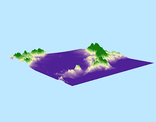
This is a DEM of the southern half of the San Francisco Bay Area from (-122.566, 37.313) to (-121.963, 37.783). This is where I grew up, which is why I wanted to explore its topography. I used to hike through the Santa Cruz mountains a lot when I was younger, looking for reptiles and amphibians and they remain my favorite mountain range. I have lots of amazing memories hiking and camping in these mountains with my family and friends. The GCS used is the North American 1983 and the datum used is the North America 1983.

Shaded Relief Model


Slope Map


Aspect Map


3D Image of Area